Ahmad Basheer — Portfolio

Five directions.
One portfolio.

A from-scratch portfolio for a systems builder. Every screen below carries the same functional set — the headline, the five-section navigation, the live-status indicator, the metrics row, and the six live properties. What changes is layout and theme only. Nothing was added, nothing was removed.

5 directions 1672×941 frames Image2 · built-in lane 2026-09-13
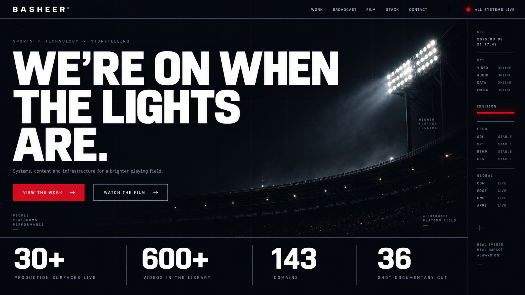
Direction 01 — Obsidian Grid
Direction 01

Obsidian Grid

Cinematic stadium-grade dark. The hero is the night-before quiet of a venue — one continuous lighting bank, deep obsidian, a single red ignition line running down the telemetry rail.

The five-section nav stays top-right; the live-status dot and the four metrics sit on hairlines exactly as the content demands. Loudest headline, quietest interface.

Dark obsidianEditorial scale Telemetry railRed ignition accent
Palette
Mood
Cinematic, expensive, understated
Best for
Making the venue work the hero
Direction 02 — Holographic Command
Direction 02

Holographic Command

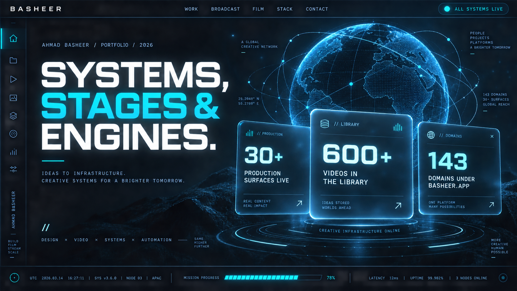
Mission-control glass. A wireframe globe sits behind three frosted panels that carry the production metrics, lit in electric cyan. Reads as an instrument, not a page.

Densest of the five — a left icon rail, a telemetry footer with node counts, and the metrics rendered as floating cards. The strongest "this person runs infrastructure" signal.

GlassmorphismWireframe globe Telemetry footerCyan signal
Palette
Mood
Operational, instrumented, sci-fi
Best for
Proving systems depth fast
Direction 03 — Monolith
Direction 03

Monolith

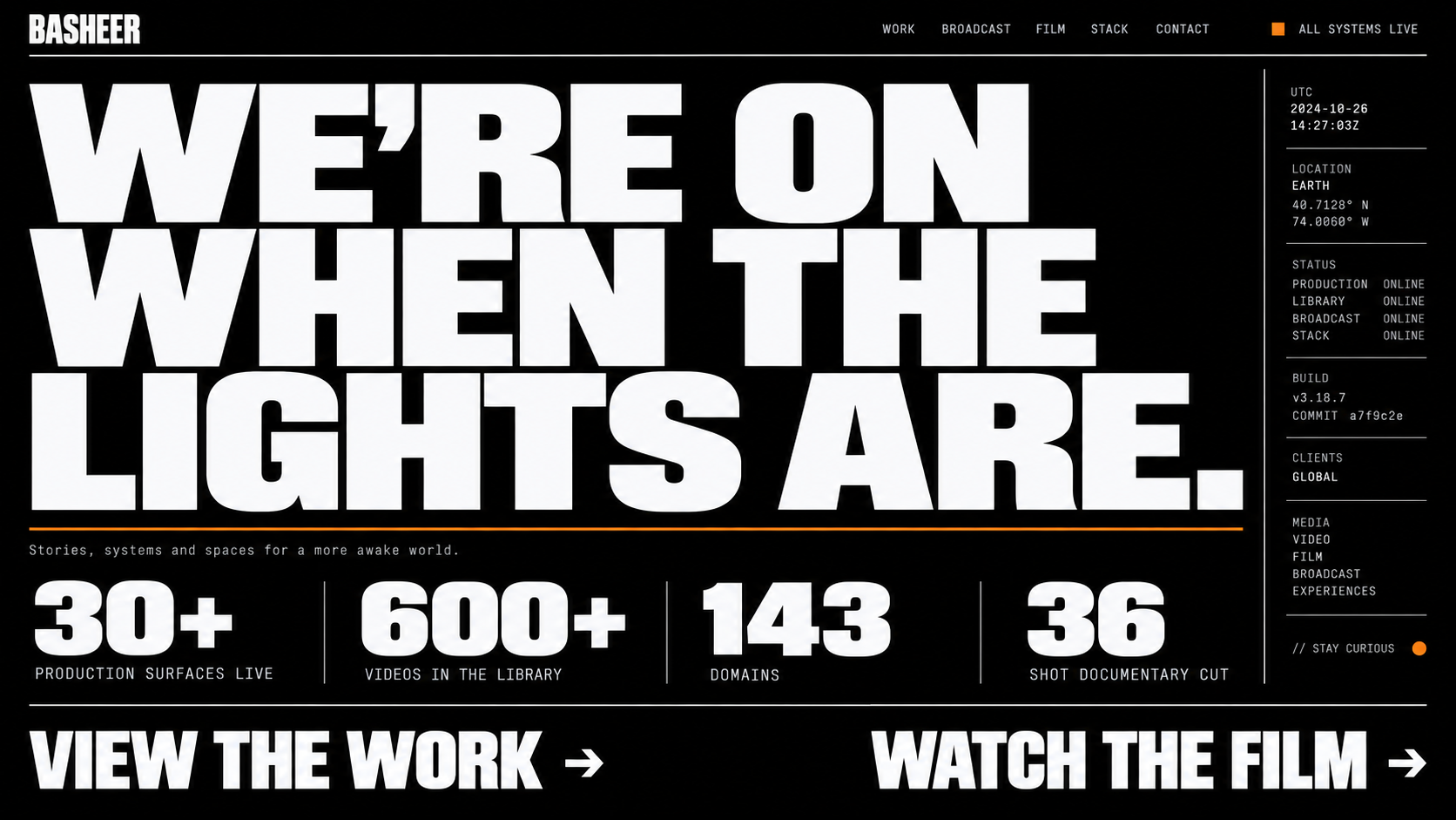
Pure black, pure type, one amber accent. No glow, no gradient, no ornament — the headline runs edge to edge and the numbered metrics sit on hairlines beneath an amber rule.

The most confident of the five and the cheapest to build faithfully. It ages best because there is nothing trendy in it to date.

BrutalistZero ornament Amber accentMax contrast
Palette
Mood
Severe, architectural, fearless
Best for
Instant authority
Direction 04 — Liquid Chrome
Direction 04

Liquid Chrome

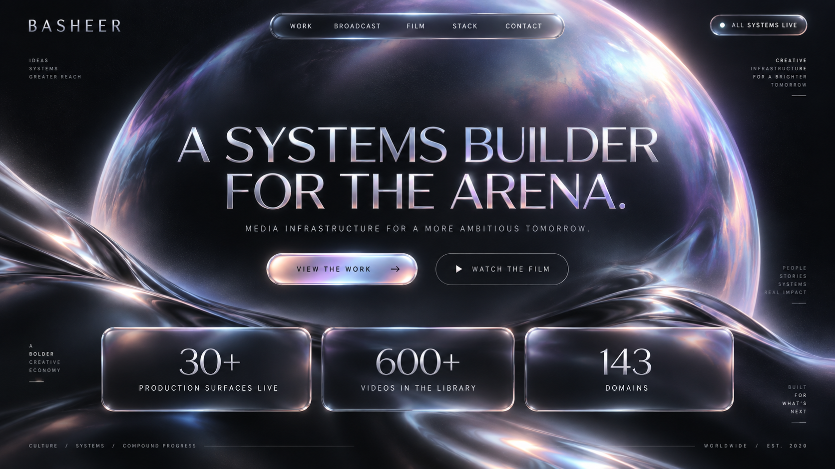
Iridescent metal. Large liquid-chrome fields bleed through the negative space, the headline carries a subtle sheen, and the metric panels catch reflections along their top edges.

The most overtly premium direction — closest to a luxury brand film. It also carries the most production risk: this material is the hardest to reproduce precisely in the browser.

Iridescent chromeSoft depth Centered heroFilm grain
Palette
Mood
Luxurious, tactile, high-fashion
Best for
Premium positioning
Direction 05 — Bento Live-Index
Direction 05

Bento Live-Index

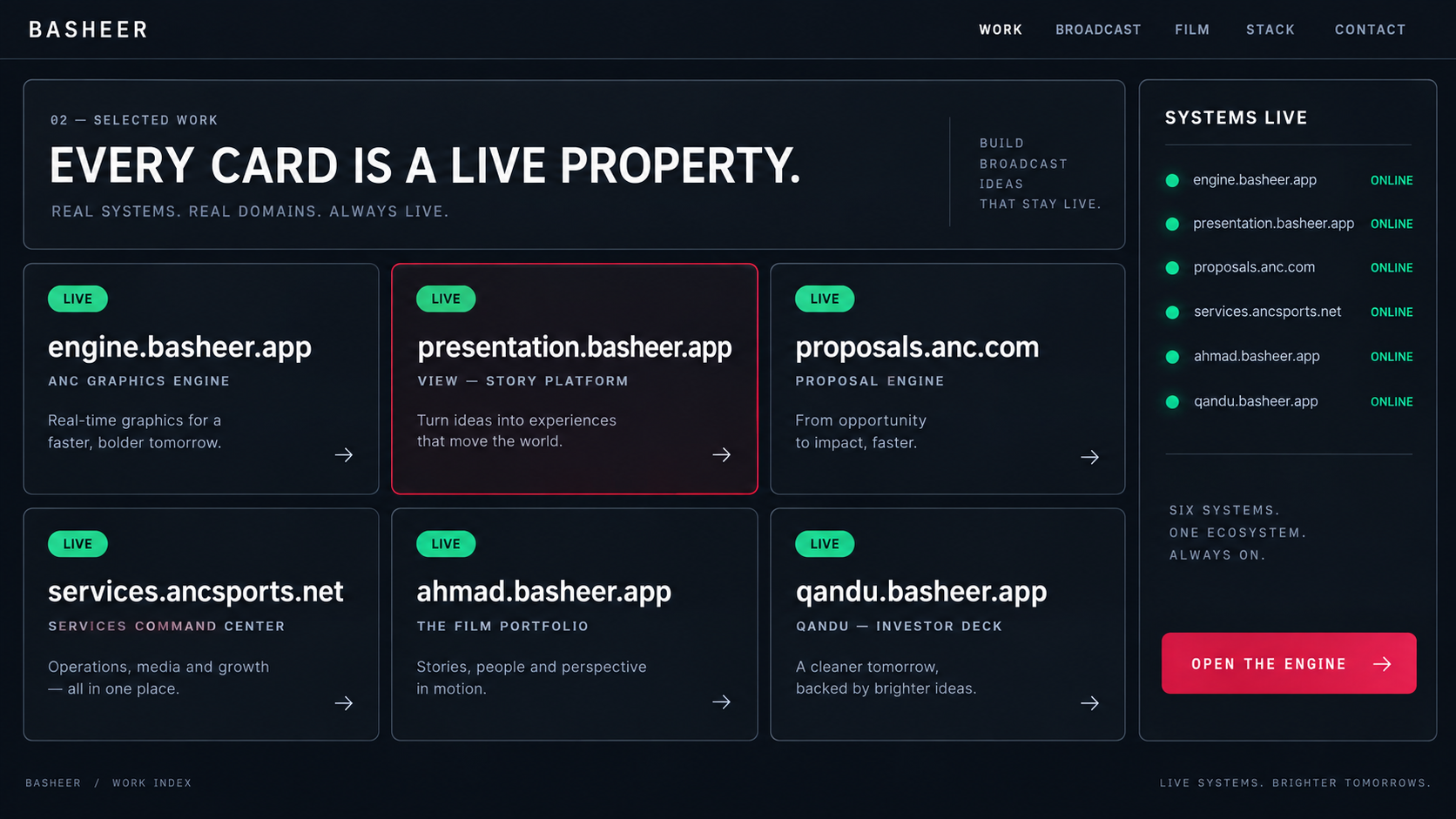
The only direction that shows the work index rather than the hero — six bento panels, each a live property with its own status pill, beside a persistent systems rail.

Functional rather than atmospheric: it answers "what has he actually shipped?" in one screen. Signal green for live state, red reserved for the single primary action.

Bento gridProduct-grade Live status railGreen/red semantics
Palette
Mood
Operational, credible, dense
Best for
Proof over atmosphere

Reading this set

All five are wireframe-equivalent. The headline, the WORK · BROADCAST · FILM · STACK · CONTACT navigation, the ALL SYSTEMS LIVE status indicator, the four metrics, and the six live properties are present in every frame — only arrangement and theme move. Any direction can be built without touching functionality.

Directions 01 and 03 are the safest builds and the most faithful to the existing brand grade. Direction 02 carries the strongest technical signal. Direction 04 is the most premium but the hardest to reproduce exactly. Direction 05 is the natural companion page to whichever hero is chosen — it works as the work index regardless of the hero direction.